Read the light first
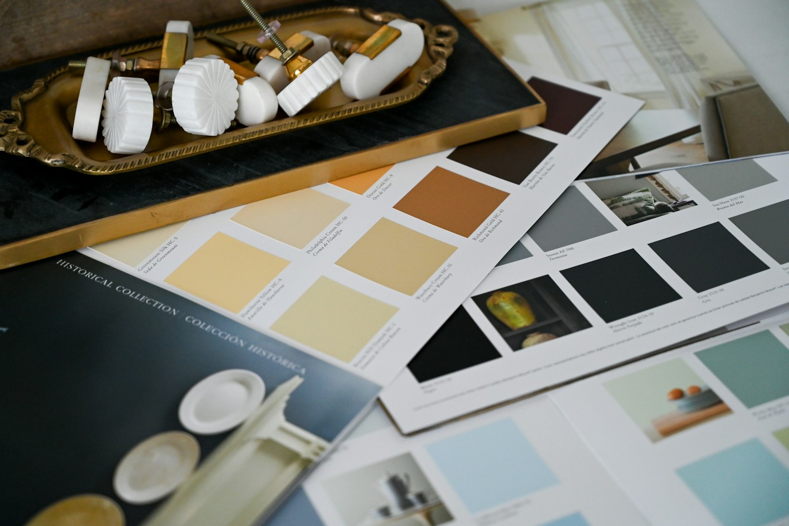
Daylight, artificial light and neighbouring surfaces all affect colour. Review sample boards at different times of day and beside the materials that will actually be installed.
Set a base and an accent
A restrained base can let furniture, signage or a focused area carry the stronger colour. Consider where contrast helps orientation and where too much visual activity may become distracting.
Test the complete composition
Look at paint, flooring, upholstery and joinery together. Colours that seem balanced in isolation can compete once combined. Let the intended use of each area guide the final balance.
Map activity before assigning desks
Write down the tasks people perform, how often teams overlap and when visitors arrive. A desk count alone will not reveal the need for private calls, project tables or storage.
Take this into your brief.
- Make one palette board for the whole space.
- Test colour on a larger sample in situ.
- Use readable contrast for signs and essential information.
Write down one priority, one constraint and one question you still need to answer. Review them beside the plan or material sample before agreeing the next design decision.