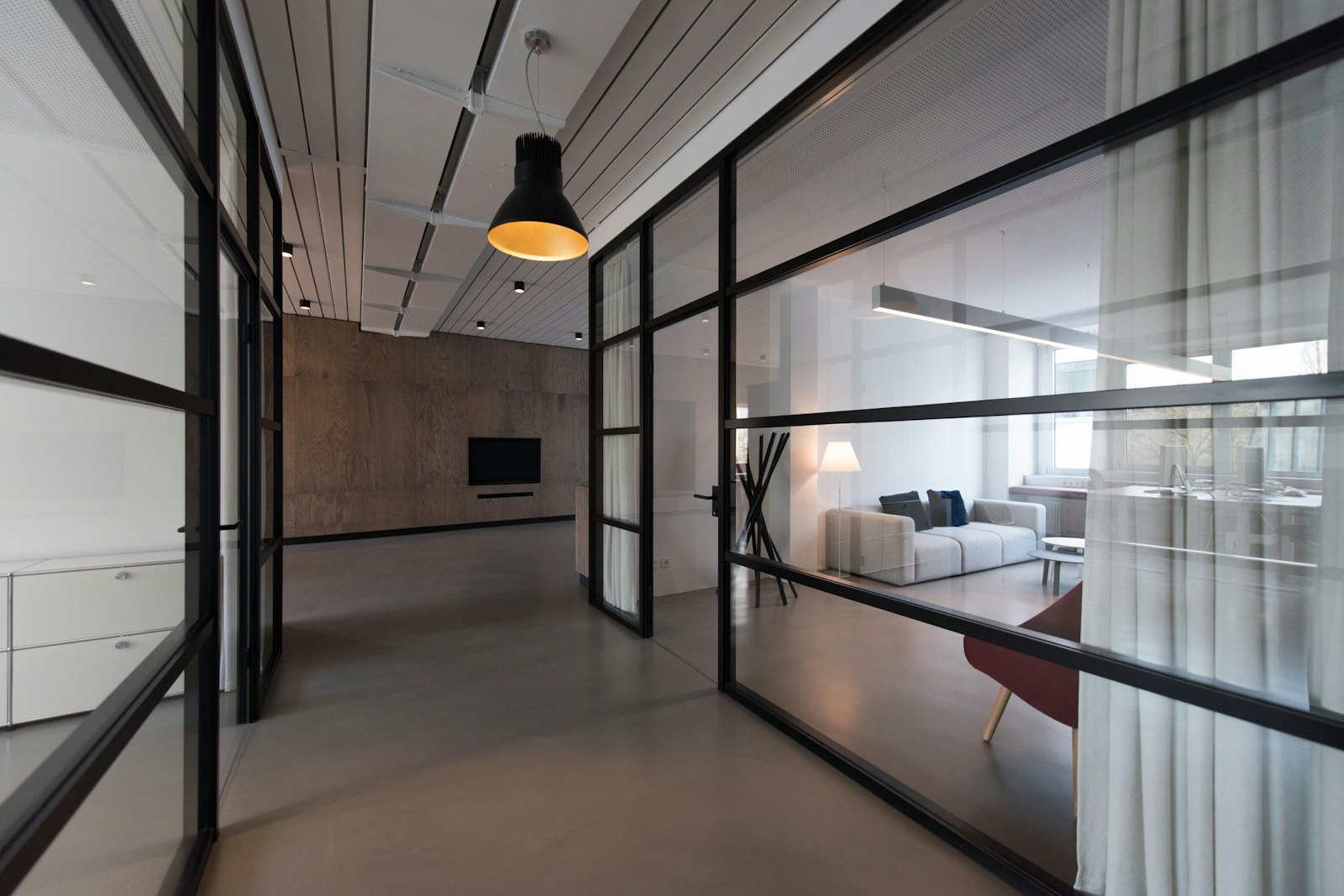
Think of arrival as a walk
An entrance is usually drawn as a single moment: a pair of glass doors with a name above them. Visitors do not experience it that way. They step out of a lift or off the street, look around, find a direction, walk a short distance, pass through a threshold and then see the office for the first time. The impression they form is the sum of that walk.
Treating the entrance as a sequence changes what you design. Instead of investing everything in a feature wall behind the reception desk, you consider each stage in turn: where a visitor stands when they first need to orient themselves, what they see as they approach, how the light changes, what the floor feels like underfoot and what the office reveals at the moment the door opens.
In a multi-tenant building the sequence starts in a space you do not control. The lift lobby belongs to the landlord, with its own flooring, lighting and signage standards. Some buildings permit a tenant panel beside the lift; others allow only a name on a shared directory.
Find out what is allowed before designing anything. Within the building management's limits, there is often more room than expected. A well-placed directional sign, a door finish that differs from the corridor's standard, or a change of light at the point where the common area meets your tenancy can mark the boundary clearly. On a floor shared with several companies, that clarity matters: a visitor who has to read three identical doors before finding yours begins the meeting slightly irritated.
For ground-floor offices or independent buildings, the sequence begins at the street or the parking area. Think about shade from the afternoon sun, a covered approach for the monsoon, a mat well that catches grit and water, and a place to leave a dripping umbrella before stepping onto a polished floor.
Use compression and release
One of the oldest devices in architecture is the move from a low, narrow space into a taller or wider one. The contrast makes the second space feel more generous than its dimensions alone would suggest.
Office entrances can use the same idea at a modest scale. A short vestibule with a lowered ceiling, or a corridor lined with storage, can open into a reception area with a higher ceiling or a long view across the floor. The vestibule also does practical work: it buffers air-conditioned air from a warm lift lobby, holds a security reader or a visitor screen, and gives a moment of transition before the visitor is seen.
The opposite is also worth avoiding. An entrance that opens directly onto rows of desks, with no pause, leaves visitors feeling that they have walked into someone's workspace uninvited, and leaves staff feeling watched.
Decide what is glimpsed
The first view through the door is the most considered image the office offers. It should be chosen, not left to chance.
A glimpse of people working at a long table, a stair, a planted court or a window with a view outside can communicate the character of an organisation more honestly than a branded wall. What should be avoided is equally clear: the back of a storage unit, a printer station, a server cupboard door or a pantry sink. Walk the approach with the plan and mark the sightlines at the door, at the reception desk and from the waiting seats. Adjust partitions and furniture so that each one lands on something worth seeing.
Some partial screening helps. A slatted timber screen, a frosted band on glass or a planted shelf can suggest the office beyond without exposing it entirely. Visitors read activity and scale, and staff keep their privacy.
Light the approach
Light guides people before signs do. A brighter destination at the end of a dim corridor draws the eye; a wash of light on a wall indicates where to turn. Use these effects deliberately.
Keep the approach gently lit, then increase the level at the reception and the first view. Avoid bare downlights directly above the point where a visitor stands to speak, since they cast hard shadows on faces. Warm, indirect light on vertical surfaces tends to make a space feel welcoming, while glare from a bright west window behind the reception desk turns the person seated there into a silhouette. If the entrance faces strong afternoon sun, plan for blinds or external shading from the start.
Choose materials underfoot and at hand
People notice what they touch and walk on. The change from the landlord's vitrified tiles to your own floor is a clear signal of arrival. Timber-look flooring, a terrazzo threshold, a band of local stone or a dense carpet each announce the boundary differently.
Choose with the climate in mind. During the monsoon, visitors bring in water and grit on their shoes, so the first few metres need a recessed entrance mat and a surface that is not slippery when wet. Door handles, push plates and the reception counter edge are touched hundreds of times a day; brass, solid timber and textured stone age gracefully, while lacquered finishes show wear quickly.
Let signage do quiet work
Wayfinding should answer three questions at the moment they arise: am I in the right place, where do I go now, and where are the toilets and the exit. Answer them with small, legible signs placed at eye level, in a consistent typeface and contrast that can be read easily by people with less than perfect sight.
The organisation's name belongs in the sequence, but it does not need to carry it. When the threshold, the light, the materials and the first view are all considered, a modest logo at the door is enough. The arrival itself does the communicating.
Walk it before you build it
Before finalising the entrance, walk the route on site with the drawings in hand, ideally at the time most visitors arrive. Stand where they will stand. Note what they see, where they hesitate and what they touch. The most useful insight usually comes from simply walking in as a stranger would.